
Case Study
RubberCycle: telling a circular-economy story instead of an eco-cliché
RubberCycle turns end-of-life mining tyres into reusable material: a genuinely circular business that needed a website able to explain a physical, industrial process without falling back on generic "green" design.
- Client
- RubberCycle
- Industry
- Circular economy & tyre recycling
- Location
- Central Queensland
- Live site
- rubbercycle.com.au ↗
01 /The Challenge
RubberCycle's business is specific and physical: tyres go in, processed rubber material comes out, and the loop closes somewhere a mine or council can use it again. That's a harder story to tell online than "we're eco-friendly." It needed a site that could walk a visitor through an actual process, for an Indigenous-owned Central Queensland business operating at the unglamorous end of the mining supply chain, not the polished end most mining-services marketing shows.
The default visual language for a recycling company website is a well-worn cliché: green leaves, recycling-triangle icons, stock forests. None of that fits a business whose actual product is reclaimed rubber from mining tyres, and leaning on that cliché would have flattened exactly what makes RubberCycle worth paying attention to: a real, working, regionally-owned circular economy operation rather than a corporate sustainability pledge.
02 /Our Approach
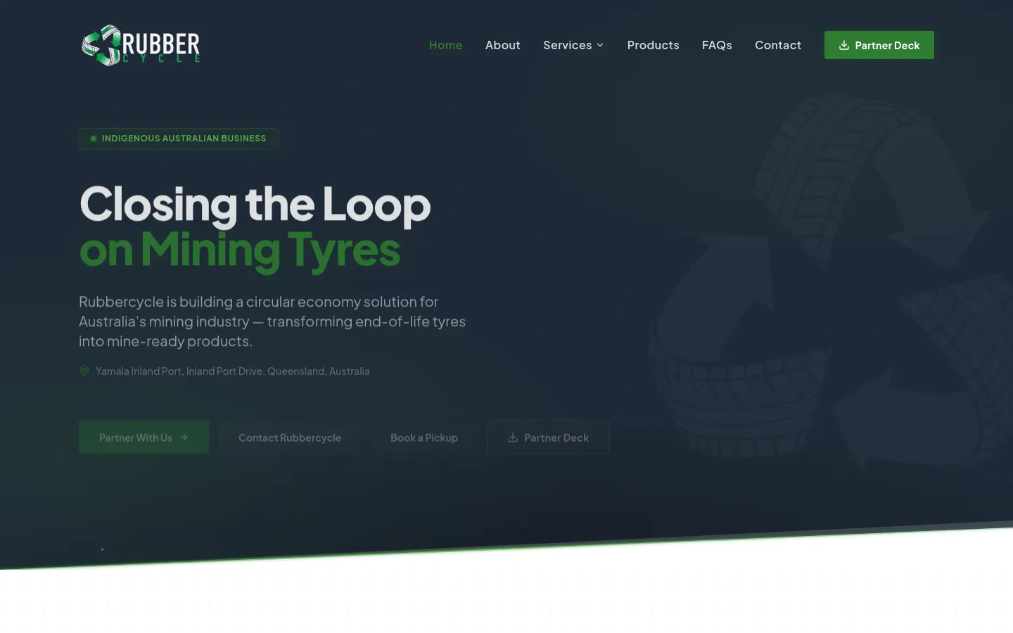
Echo Technology built the site around the material's actual journey: a scroll-driven narrative where the collection, processing and reuse loop unfolds section by section, rather than being explained in one static paragraph. The site's own title sums up the pitch in five words: "Closing the Loop on Mining Tyres."
Impact figures animate into view as a visitor scrolls to reach them, timed to the story rather than dumped at the top of the page, so visitors get the process first and the scale second.
Because RubberCycle sits inside the Central Queensland mining supply chain, the site had to read credibly to two different audiences at once (mine-site procurement teams and council waste-management contacts) without splitting into two separate pages to do it. Both audiences needed the same core proof: that the loop is real, verifiable, and already operating, not a sustainability pitch deck.
03 /Design Notes
The palette is earth and ochre rather than the recycling industry's default bright green, a deliberate choice that also nods to the business's Indigenous ownership without resorting to literal iconography. Curved section dividers replace hard edges throughout, echoing the loop the business is named for, and standing in visible contrast to the sharp, angular treatment used on Echo Technology's mining-sector work for MCC Group.
Stats animate in only once they're in view, so scale claims land as a payoff to the story rather than a banner headline competing with everything else on the page. The pacing is deliberate: nothing on this site is trying to be read in five seconds, because the story it's telling doesn't compress that far.
04 /Tech Stack
- Next.js
- React
- TypeScript
- Tailwind CSS
- Vercel
05 /The Outcome
The finished site gives RubberCycle a distinct visual identity in a category where most recycling company website design defaults to the same green-and-leaf template, useful when the business is trying to stand out to mining and council clients weighing multiple suppliers.
It's also a genuine Central Queensland web design project: real client work grounded in the region, not a generic "we serve all of QLD" claim. Alongside MCC Group and CQ Computing, it's evidence Echo Technology's regional client work is real, current, and spread across genuinely different industries rather than one repeated template.
What we did