
Case Study
Brienna's Cosmetic Clinic: a site built to book, not browse
Brienna's Cosmetic Clinic offers cosmetic injectables and aesthetics treatments across the Gold Coast and Sunshine Coast. Every design decision on the site works toward the same goal: getting a visitor into a booking, calmly and without pressure.
- Client
- Brienna's Cosmetic Clinic
- Industry
- Cosmetic injectables & aesthetics clinic
- Location
- Gold Coast & Sunshine Coast, QLD
- Live site
- briennascosmeticclinic.com.au ↗
01 /The Challenge
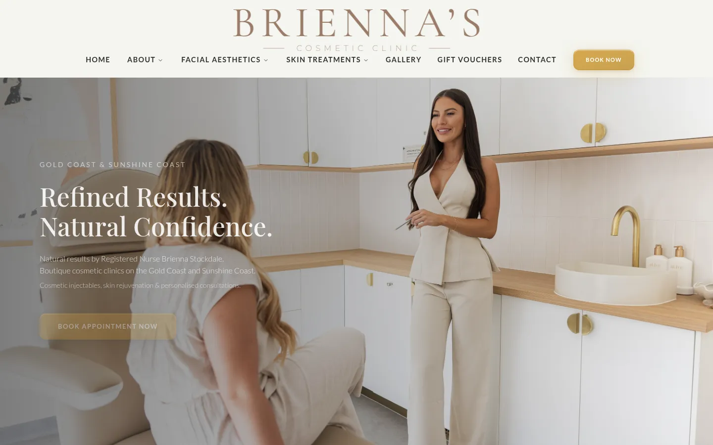
Cosmetic clinic websites sit in an unusual spot: visitors are often nervous, price-sensitive and self-conscious about the decision itself, so a site that pushes too hard reads as exactly the wrong kind of clinic to trust with an aesthetic procedure. Brienna's needed web design for a cosmetic clinic that could sell confidence and calm at the same time as driving bookings, for a business operating across two coastal regions rather than one suburb. Get the tone wrong in either direction, too clinical or too salesy, and the site works against the decision it's meant to support. The industry default (bright before/after galleries, countdown-timer promotions, aggressive pop-ups) is precisely the tone that erodes trust for this kind of clinic. The brief was the opposite: unhurried and refined, while still commercially effective.
Serving two regions rather than one added a structural problem on top of the tone problem: the site needed to feel local and specific to a Gold Coast or Sunshine Coast visitor without duplicating pages into two near-identical sites, and without either region reading as an afterthought to the other. A clinic asking visitors to trust it with an aesthetic decision doesn't get much benefit of the doubt if the site itself feels like a template with a suburb swapped in.
02 /Our Approach
Echo Technology designed the site around a slower pace than a typical service-business site. Pages ease into content rather than snapping straight to an offer, and the booking prompt is present but never shouting.
Refined typography and a calm, neutral palette replace the bright, clinical white-and-teal look common to cosmetic clinic websites, aiming for the same tone the clinic itself tries to set in person.
Every page funnels gently toward the same booking flow rather than scattering the ask across competing calls to action, so a visitor never has to hunt for how to actually make an appointment. Copy throughout stays deliberately restrained: describing what a visit involves rather than dramatising a before-and-after result, which keeps the site clear of the exaggerated claims the category is prone to.
03 /Design Notes
Transitions ease in and out rather than snapping between states, a small technical choice that reinforces the unhurried tone the whole site is going for, page by page.
The neutral palette and refined type carry the clinic's positioning without needing clinical-white sterility or beauty-industry gloss to do it, closer to a considered aesthetics practice than a walk-in cosmetic chain.
04 /Tech Stack
- Next.js
- React
- TypeScript
- Tailwind CSS
- Vercel
05 /The Outcome
The result is a cosmetic clinic website that carries a booking-focused commercial goal without tipping into the pushiness that tends to undercut trust in this category: a balance most cosmetic clinic web design gets wrong in one direction or the other, either underselling the practice or overselling the procedure.
No treatment claims are made in this copy beyond what's on the clinic's own site. Cosmetic advertising in Australia is tightly regulated, and this case study describes the website build, not the clinic's services, deliberately staying out of territory that isn't Echo Technology's to speak to.
What we did