
Case Study
FitDad: a website built for a brotherhood, not a gym
FitDad needed a site that could sell an idea before it sold a program: weekly accountability between dads who train together. Echo Technology built a fast, high-contrast site that gets that across in one scroll.
- Client
- FitDad
- Industry
- Fitness & community
- Location
- Australia
- Live site
- fitdadmovement.com.au ↗
01 /The Challenge
FitDad isn't a gym, a bootcamp, or an app. It's a standing weekly commitment between dads who hold each other accountable. That's a hard thing to sell on a website: there's no class timetable to browse, no PT package price list, nothing you can point at and call "the product." The site had to do the selling with tone and pace alone, before a visitor had met anyone in the group.
The brief also had to work for an audience that's usually cynical about fitness marketing: dads who've scrolled past every "transform your body in 30 days" pitch without stopping. Generic web design for gyms and fitness brands (class schedules, trainer bios, membership tiers) would have undercut the whole pitch before it started.
02 /Our Approach
Echo Technology built FitDad on Next.js and Tailwind, structured around a small number of single-idea sections (the Creed, the community mechanic, the join flow) rather than a wall of features competing for attention.
The homepage states its own positioning directly: "A brotherhood of dads who meet weekly, train together, keep score, and take the piss in equal measure. Not a gym. Not a bootcamp." That line, pulled straight from the client's own copy, set the tone for every design decision that followed: nothing polished to the point of feeling corporate, nothing that reads like a franchise. Content is organised around a small set of concrete pillars rather than abstract brand values. One of them, "The Community," gets specific fast: a private group chat for daily check-ins, described on the site as "the group that notices when you miss a Saturday." Naming the mechanism (a group chat, a Saturday session) does more to sell accountability than any amount of "join our supportive community" copy would.
The join path stays short and direct: one call to action doing one job, repeated wherever a visitor might be ready to commit, instead of scattering the ask across competing buttons.
03 /Design Notes
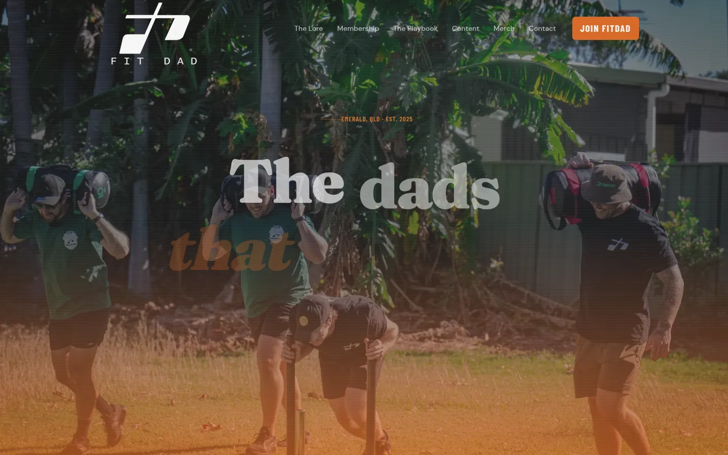
The visual language leans on heavy type, stark contrast and hard section breaks, closer to a locker-room pep talk than a wellness brand. There's no soft pastel fitness-app palette here; everything is blunt on purpose. The hero photography backs that up directly: a dad mid-rep carrying sandbags, not a posed gym-selfie shot.
Motion carries the momentum the copy talks about: numbers count up rather than simply appear, and calls to action shift forward on hover instead of just changing colour. Small choices, but they make "showing up" feel like forward motion rather than a static decision to click a button. Everything is also built mobile-first, on the reasonable assumption that most of this audience is deciding whether to join from a phone, not a desk.
04 /Tech Stack
- Next.js
- React
- TypeScript
- Tailwind CSS
- Vercel
05 /The Outcome
The result is a site that reads in seconds: a visitor lands, gets the concept ("not a gym"), and has one clear next step. It carries FitDad's tone into a category that usually defaults to stock photography and program grids.
The site is live at fitdadmovement.com.au, launched ahead of FitDad's founding-member intake.
What we did